Design System

Style Guide

Reference for the Star Mountain Capital website: colour tokens, type scale, spacing, buttons, forms and the reusable v58 components. Every value is bound to a Webflow variable.

01 · Colour

Colour tokens

SMC Color collection. Brand and neutral swatches below; components use the semantic aliases, which switch automatically inside dark sections (On Dark variable mode).

Brand

Dark Blue
#003454
Brand/Dark Blue
Medium Blue
#00588A
Brand/Medium Blue
Light Blue
#79AFE6
Brand/Light Blue
Lightest Blue
#E8E0F8
Brand/Lightest Blue
Dark Green
#2C6860
Brand/Dark Green
Light Green
#A7DAD3
Brand/Light Green
Dark Grey
#BFBFBF
Brand/Dark Grey
Light Grey
#D9D9D9
Brand/Light Grey
Blue 900
#002338
Brand/Blue 900
Blue 700
#00405F
Brand/Blue 700
Blue 400
#4A8FB5
Brand/Blue 400
Hero Deep
#0A1628
Brand/Hero Deep
Accent Cyan
#22D3EE
Brand/Accent Cyan
Tint Cyan
#F0FDFF
Brand/Tint Cyan

Neutral

White
#FFFFFF
Neutral/White
Off White
#F8FAFC
Neutral/Off White
Gray 100
#F1F5F9
Neutral/Gray 100
Gray 200
#E2E8F0
Neutral/Gray 200
Gray 300
#CBD5E1
Neutral/Gray 300
Gray 400
#94A3B8
Neutral/Gray 400
Gray 500
#64748B
Neutral/Gray 500
Gray 600
#475569
Neutral/Gray 600
Gray 700
#334155
Neutral/Gray 700
Ink
#1A1F35
Neutral/Ink

Semantic aliases

Text Heading
--_smc-color---semantic--text-heading
Brand/Dark Blue · On Dark: Neutral/White
Text Body
--_smc-color---semantic--text-body
Neutral/Gray 700 · On Dark: On Dark/Text 85
Text Muted
--_smc-color---semantic--text-muted
Neutral/Gray 500 · On Dark: On Dark/Text 75
Text Nav
--_smc-color---semantic--text-nav
Neutral/Ink · On Dark: Neutral/White
Accent
--_smc-color---semantic--accent
Brand/Medium Blue · On Dark: Brand/Light Blue
Accent Hover
--_smc-color---semantic--accent-hover
Brand/Light Blue · On Dark: Neutral/White
Border
--_smc-color---semantic--border
Neutral/Gray 200 · On Dark: On Dark/Line 20
Surface
--_smc-color---semantic--surface
Neutral/White · On Dark: —
Surface Alt
--_smc-color---semantic--surface-alt
Neutral/Off White · On Dark: —
Hero BG
--_smc-color---semantic--hero-bg
Brand/Hero Deep · On Dark: —
Footer BG
--_smc-color---semantic--footer-bg
Brand/Blue 900 · On Dark: —
CTA Band BG
--_smc-color---semantic--cta-band-bg
Brand/Dark Blue · On Dark: —
On Dark mode

Dark sections re-theme automatically

Classes background-color-navy, background-color-deep, background-color-hero, section_page-hero and cta-band apply the On Dark mode: headings turn white, muted text 75% white, accent light blue.

02 · Typography

Type scale

Playfair Display for display and headings, Libre Franklin for body and UI. Headings carry no colour or margin; they inherit, and layout gaps handle spacing.

heading-style-display
Playfair Display · fluid 40 → 60px · 1.12 · tracking -0.5px
Investing in the Growth Engine of America®
heading-style-h1
Playfair · fluid 34 → 46px · 1.12
Senior Advisors & Operating Partners
heading-style-h2
Playfair · fluid 28 → 34px · 1.25
Multi-Strategy Lower Middle-Market Asset Manager
heading-style-h3
Playfair · fluid 22 → 26px · 1.25
Collaborative Ecosystem®
heading-style-h4
Playfair · 22px · 1.4
Our Partner Service Providers
heading-style-h5
Playfair · 20px · 500 · 1.4
Direct Investments
heading-style-h6
Playfair · 18px · 500 · 1.4
Secondary Investments
text-style-eyebrow
Libre Franklin · 14px · 600 · caps · 2.5px
Star Mountain in the News
text-style-meta
Libre Franklin · 14px · 600 · caps · 1px
Press Release · 2026
text-size-large
fluid 16 → 18px · 1.6

Specialized asset management firm focused exclusively on the lower middle-market.

text-size-medium
16px · 1.6

Star Mountain capitalizes on the opportunities in the large and fragmented U.S. lower middle-market.

text-size-regular
15px · 1.75

The Firm is 100% employee owned with 100% of the full-time team participating in the profits of our funds.

text-size-small
14px · 1.6

In addition to its full-time team, the Firm is supported by 40+ Senior Advisors / Operating Partners.

text-size-tiny
12px · 1.4

Past performance is not indicative of future results.

text-style-link
Accent · 600 · underline on hover
text-rich-text
15px · 1.75 · body colour (post bodies)

Rich text inherits the body colour and relaxed leading used across Media Center posts and team bios.

03 · Space & shape

Spacing, radius and shadow

SMC Space collection. Section rhythm and gutters are fluid (clamp between the min and max tokens); everything else steps along this scale.

Space/4
0.25rem · 4px
Space/8
0.5rem · 8px
Space/12
0.75rem · 12px
Space/14
0.875rem · 14px
Space/16
1rem · 16px
Space/20
1.25rem · 20px
Space/24
1.5rem · 24px
Space/28
1.75rem · 28px
Space/32
2rem · 32px
Space/40
2.5rem · 40px
Space/44
2.75rem · 44px
Space/48
3rem · 48px
Space/64
4rem · 64px
Space/72
4.5rem · 72px
Space/88
5.5rem · 88px
padding-section-medium
fluid 60 → 84px top & bottom
Fluid/Section Y Min → Max
padding-global
fluid 24 → 60px left & right
Fluid/Gutter Min → Max
container-large / -medium / -small
1080px · 860px · 720px max-width
Layout/Content Max · Narrow Max · Prose Max

Radius/Card 8px · Radius/Button 4px · Radius/Input 6px · Radius/Pill · card shadow 0 8px 32px rgba(0,0,0,.06)

04 · Buttons & forms

Buttons, links and form fields

One size, four styles. Arrow labels are plain text (Label →).

Thank you! Your submission has been received!
Oops! Something went wrong while submitting the form.
05 · Components

Reusable components

Built once as Webflow components with props, then placed on pages. Nav, footer and the home hero are built with the homepage.

Section head — left / centred

Our Impact

Citizenship

Section head with eyebrow, heading and supporting text. Max width 720px.

Collaborative Ecosystem®

Senior Advisors & Operating Partners

Centred variant for intros that sit above card grids.

Stat row — light / on dark

80+
Full-time professionals
40+
Senior Advisors / Operating Partners
100%
Employee owned
2010
Founded
80+
Full-time professionals
40+
Senior Advisors / Operating Partners
100%
Employee owned
2010
Founded

Cards — icon / meta / list

Direct Investments

Debt and equity invested directly into established U.S. lower middle-market operating companies.

Senior Debt & Preferred Equity

Provider of Skilled Contract & IT Resources

Meta card: kicker, title and text, with an optional link cue. Used for portfolio tiles, numbered steps and post cards.

Read more →

Why Star Mountain

  • Retiring demographics.
  • Valuation arbitrage between smaller and larger businesses.
  • Lack of solutions-based capital alternatives for these businesses.
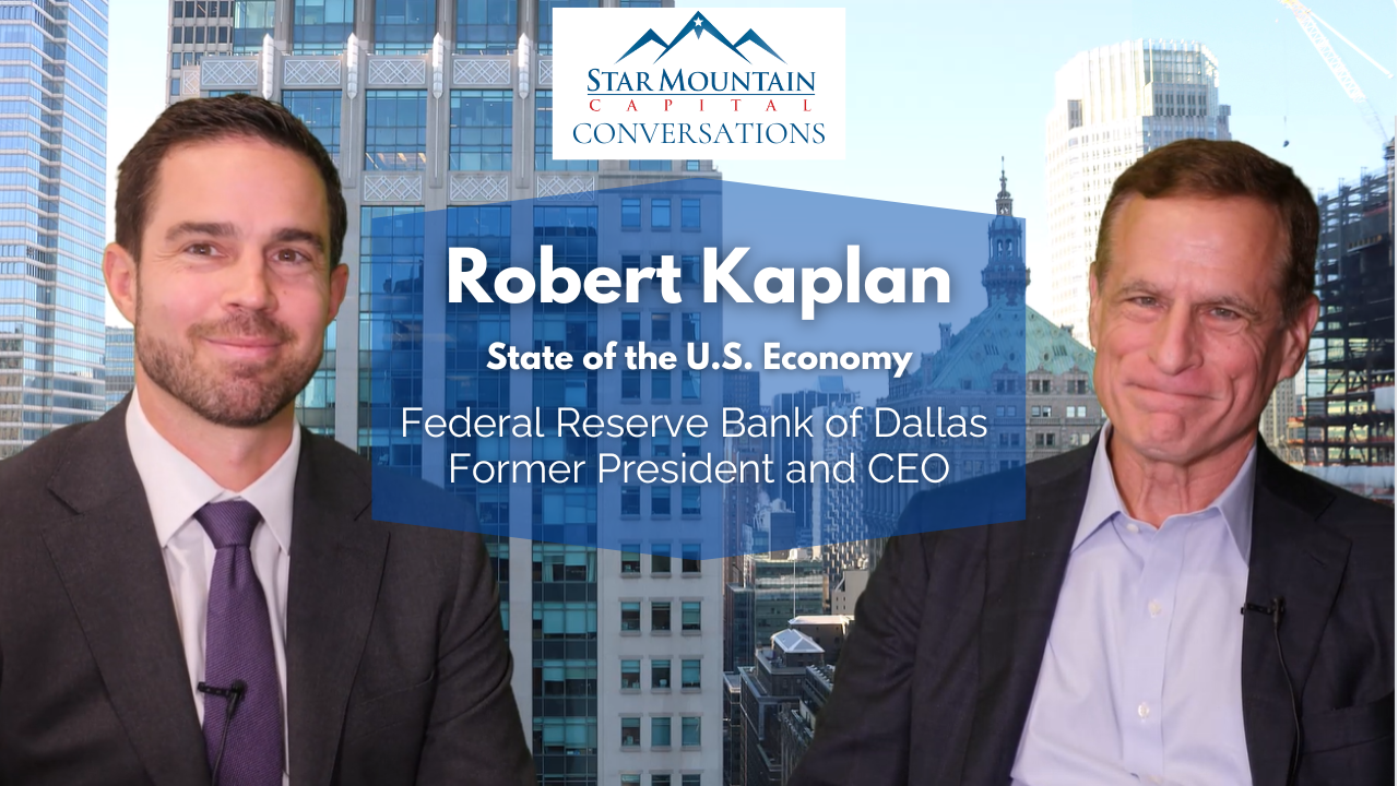
Story Card — base (16:9 thumbnail)

Image, title, rich-text summary and a CTA link. The CTA is stretched over the whole card, so the card is clickable anywhere.

Watch Here

Story Card — Logo variant

For publication logos: the media area gets padding and a white background, and the image is letterboxed (contain) instead of cropped.

Read Here

CTA band

Submit an Investment Opportunity

Share an opportunity with our origination team and we will be in touch.

Get in Touch →

Callout & disclosures

General Inquiries

Callout block with a 3px accent rule. Used for vision statements, contact notes and summaries.

Disclosures: legal copy set small and muted with a divider above. Past performance is not indicative of future results.

Accordion

MD, Origination and Direct Credit Underwriting
+
Location: Remote. Answer panel text sits here; the open/close behaviour is added with the site script.
Valuations Intern
+
Location: Tampa, Florida. Second item for spacing reference.
Brett A. Hickey

Brett A. Hickey

Chief Executive Officer

25 years of U.S. LMM private equity, private credit and secondary fund investment experience

Construction Management for Public & Private Infrastructure

Senior Debt

Construction Management for Public & Private Infrastructure

ATLANTA, GA

ATLANTA, GA

1201 Peachtree St NE, 1st Floor, 30361

Timeline title

Timeline text

Chip label